
Project OVERVIEW
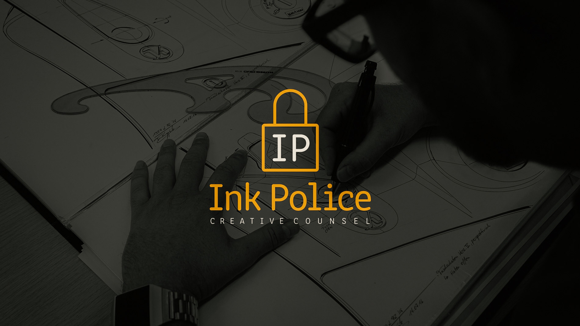
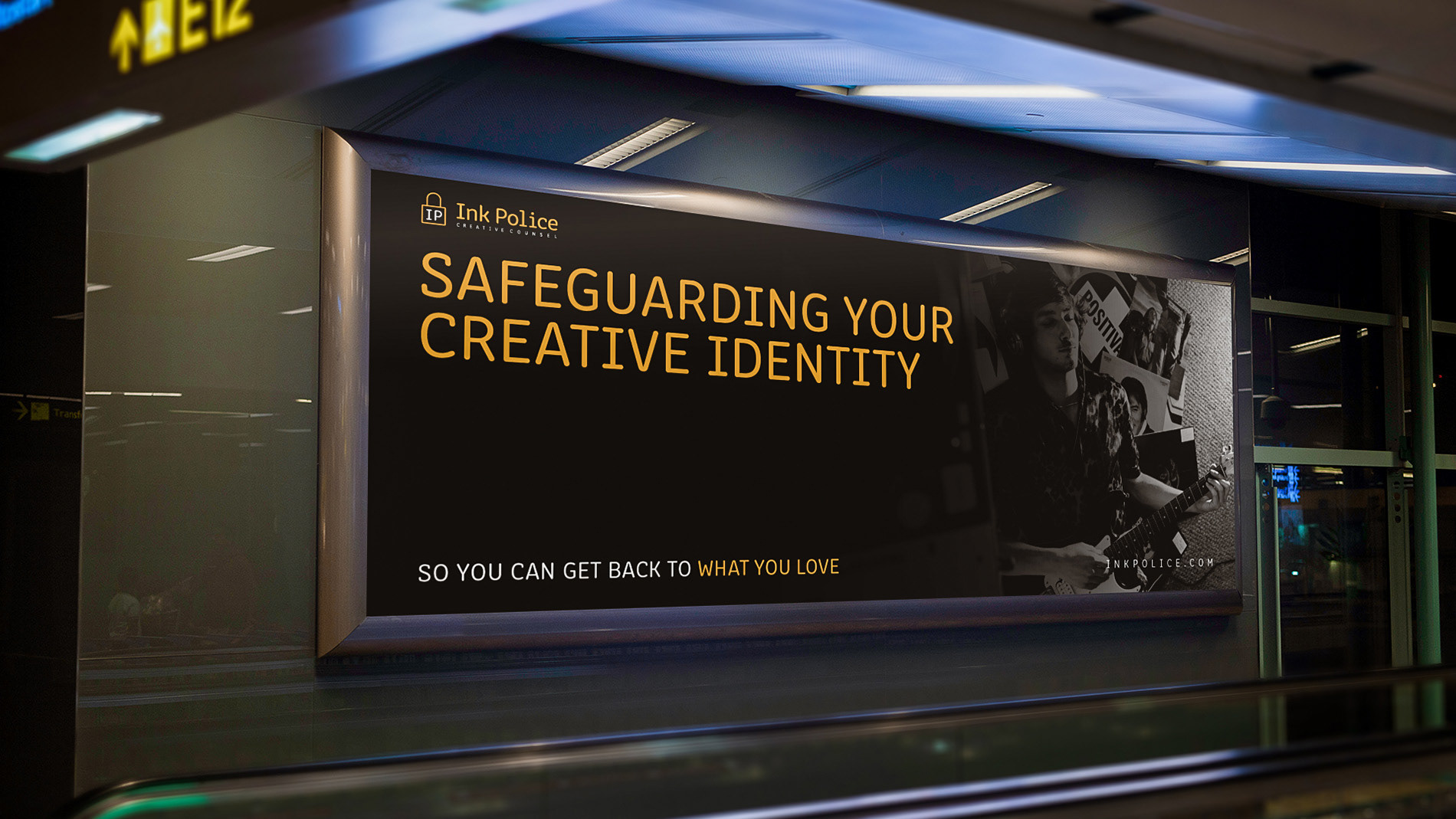
Ink Police is a fictional company that was created as part of a branding project at The Los Angeles Film School. They provide legal and management services specifically designed for modern creatives.
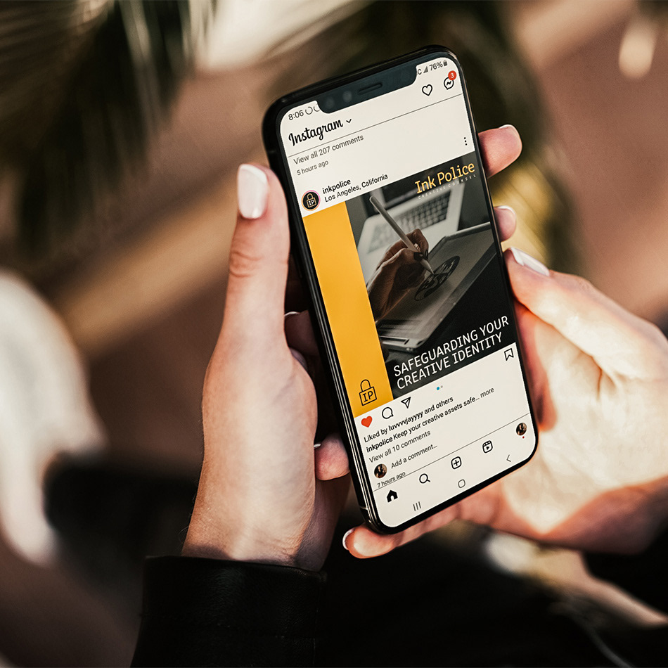
The main goal of Ink Police is to ensure that one's name and creative assets are safe in the digital landscape.
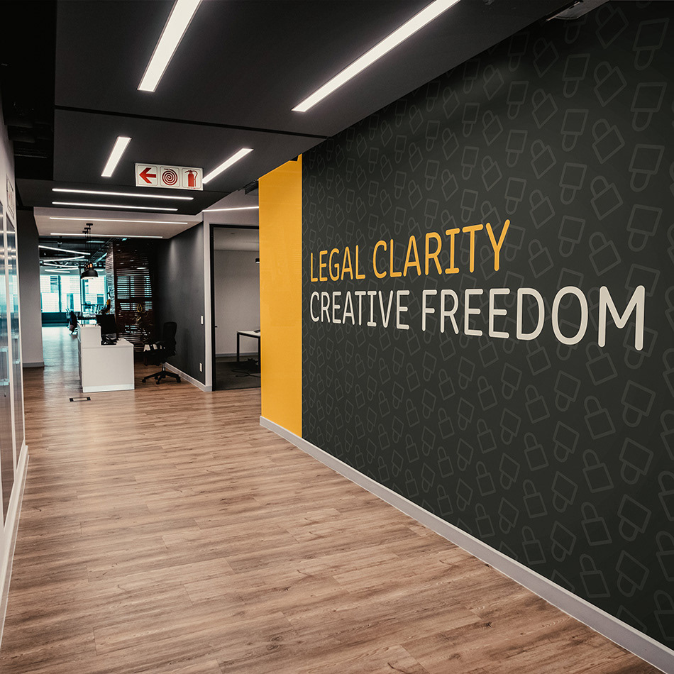
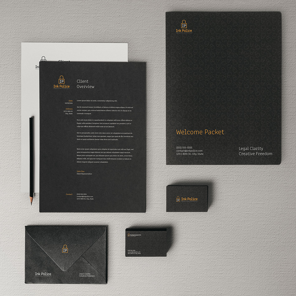
The brand identity was designed with simplicity in mind, reflecting the idea of a company that acts as a silent guardian. This provides clients with the assurance to explore their creativity without fear of compromising their assets.
The main goal of Ink Police is to ensure that one's name and creative assets are safe in the digital landscape.
The brand identity was designed with simplicity in mind, reflecting the idea of a company that acts as a silent guardian. This provides clients with the assurance to explore their creativity without fear of compromising their assets.
Design Solution
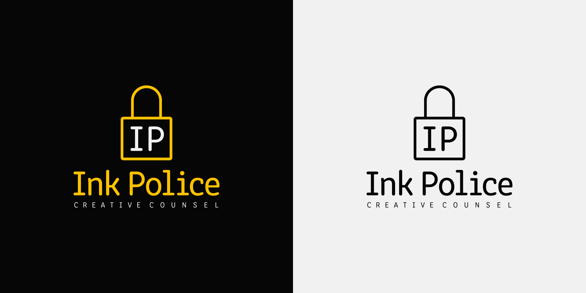
I aimed to prioritize simplicity while emphasizing professionalism and security with the primary icon. There was a great opportunity to utilize the company's initials as a reference to Internet Protocol (IP). The padlock icon safeguards the initials and communicates the commitment to keeping creative works and digital information secure.
Pairing the padlock icon with Clone Rounded PE, inspired by coding fonts, adds a friendly touch. The color palette, including a distinctive yellow, reinforces the legal and digital protection aspects of Ink Police.
This solution ensures an approachable representation while effectively communicating the brand's commitment to integrity and securing a broad digital landscape.