project OVERVIEW
While working on a Design Strategy assignment at The Los Angeles Film School, I focused on revamping the brand of S-Curve Records.
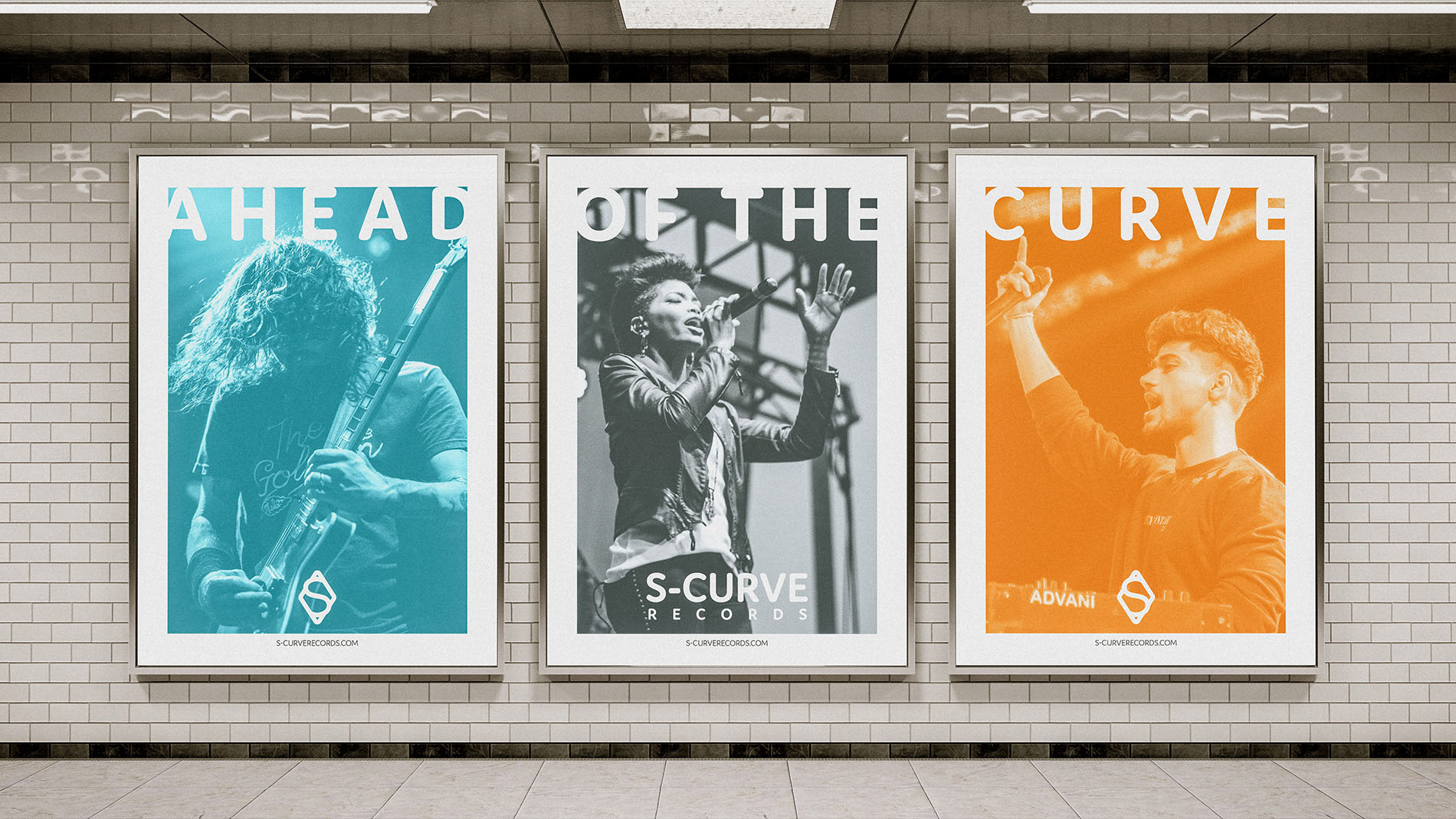
My main goal was to increase brand recognition and value by crafting a new visual identity that emphasizes the company's unique strengths and its collaborative history with diverse artists.
S-Curve Records is known for providing artists with more time and resources, which inspired me to create an identity that communicates approachability, skill, and the ability to build strong client relationships very quickly.
The logo is designed to be legible across various sizes and strike a tasteful balance between creativity and professionalism.

Design Solution
Within the redesigned logo, the diamond prominently features a protruding S shape, reminiscent of a vertically-oriented Sine Wave. This design articulates not only an upward trajectory but also embodies the brand's commitment to forward-thinking ideals and guiding artists on a path to success.
The interplay between the rounded S and angular diamond signifies the seamless integration of creativity and business.
Combining the icon with a rounded typeface was an intuitive choice at this stage. Domus, with its smooth curves and clean lines, encapsulates the label's skillset while aligning perfectly with the brand's intimate and attentive approach to artist relations.
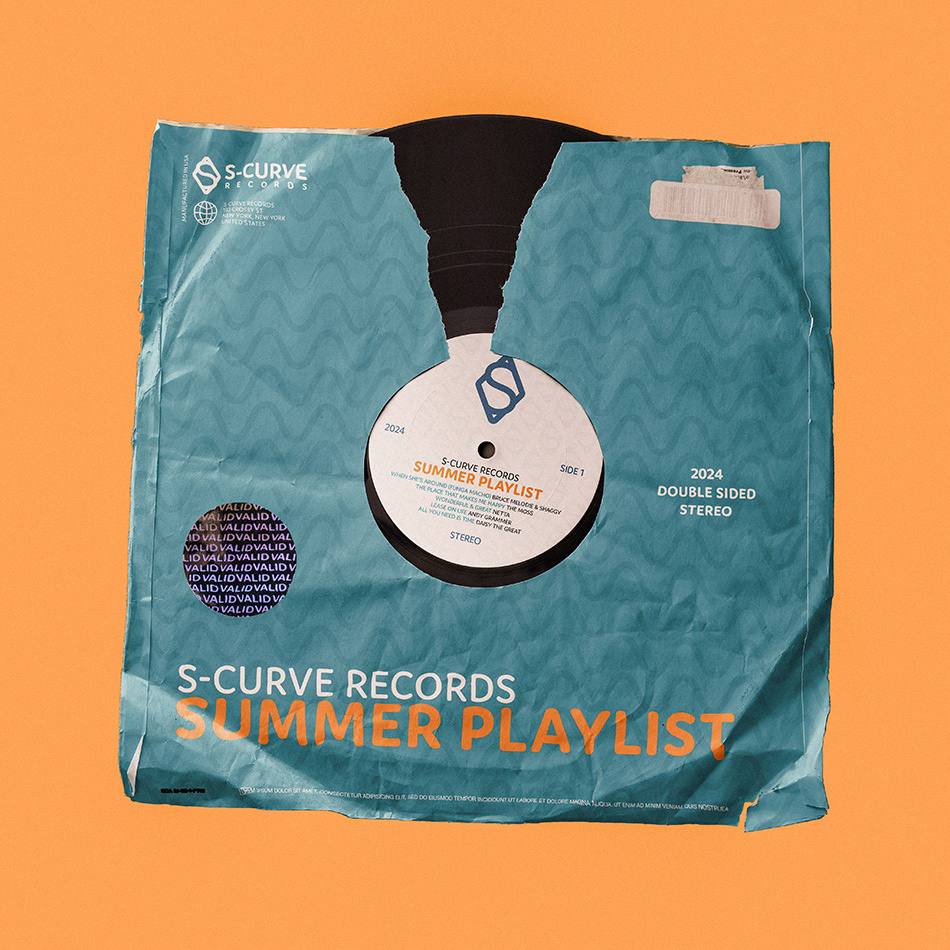
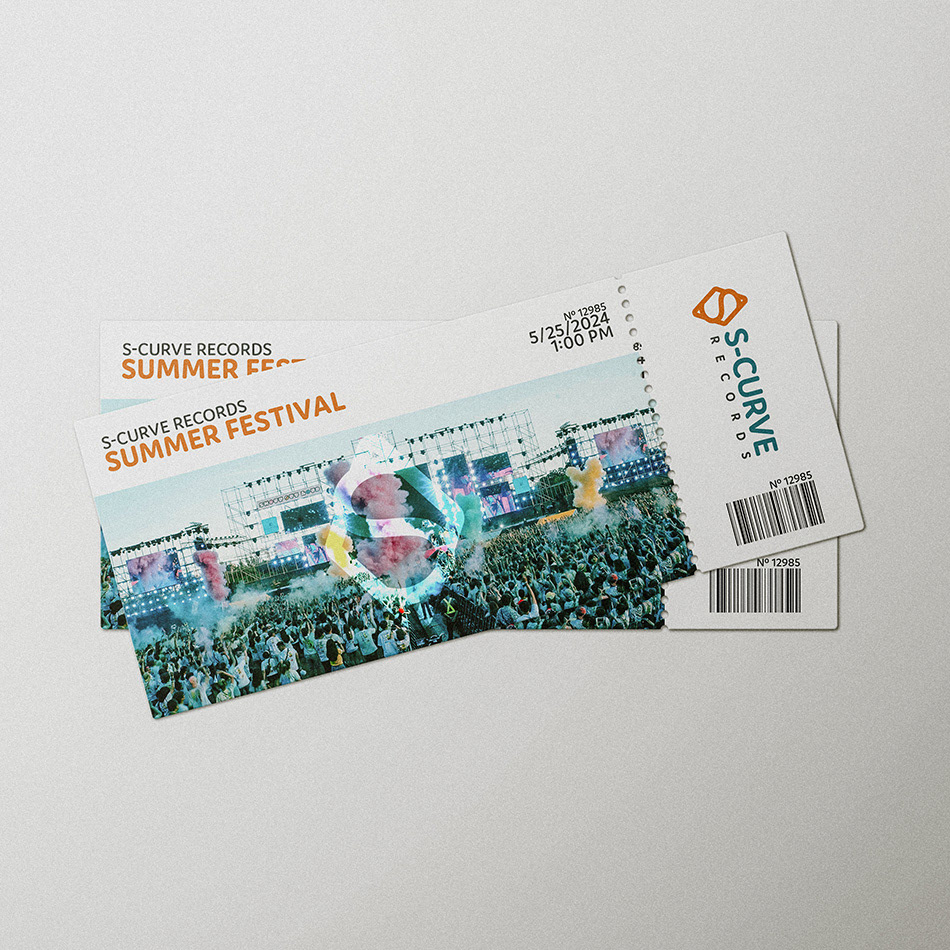
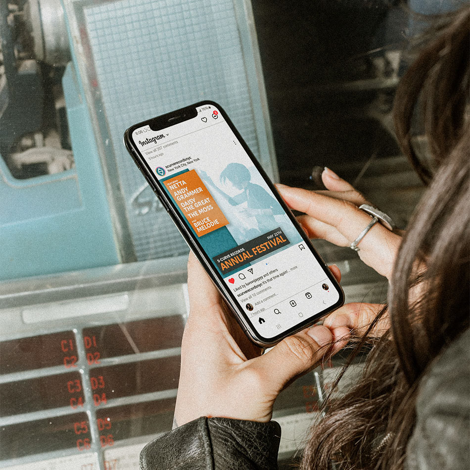
The color palette revolves around the blending of trustworthiness and artistic innovation. The rich, calming blue establishes a foundation of trust while the lively orange sparks creativity. The juxtaposition of these colors not only signifies balance, but also conveys a brand that is reliable yet dynamic.
The interplay between the rounded S and angular diamond signifies the seamless integration of creativity and business.
Combining the icon with a rounded typeface was an intuitive choice at this stage. Domus, with its smooth curves and clean lines, encapsulates the label's skillset while aligning perfectly with the brand's intimate and attentive approach to artist relations.
The color palette revolves around the blending of trustworthiness and artistic innovation. The rich, calming blue establishes a foundation of trust while the lively orange sparks creativity. The juxtaposition of these colors not only signifies balance, but also conveys a brand that is reliable yet dynamic.